HOT WHEELS
Strategy | Art Direction | UX
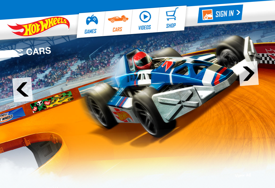
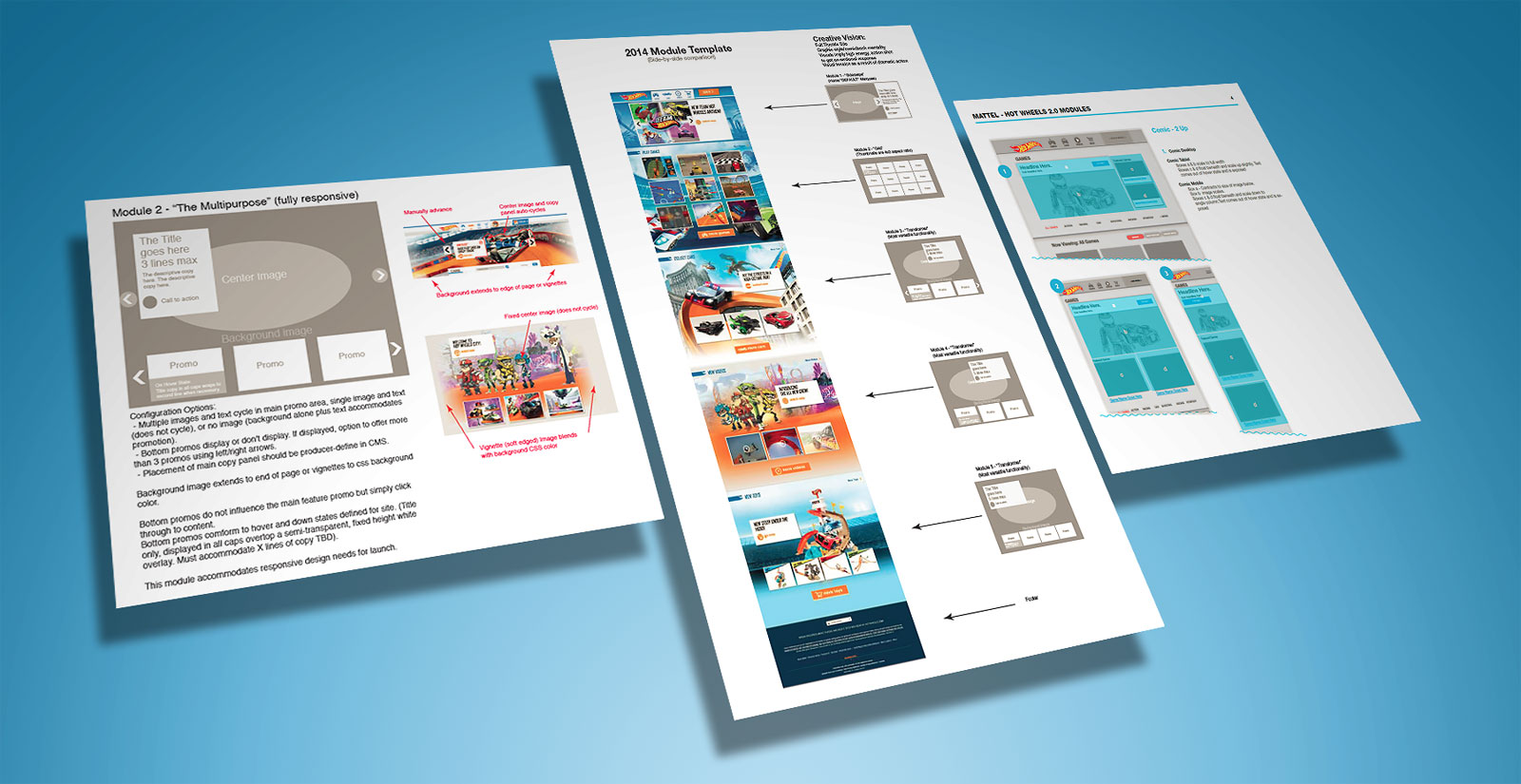
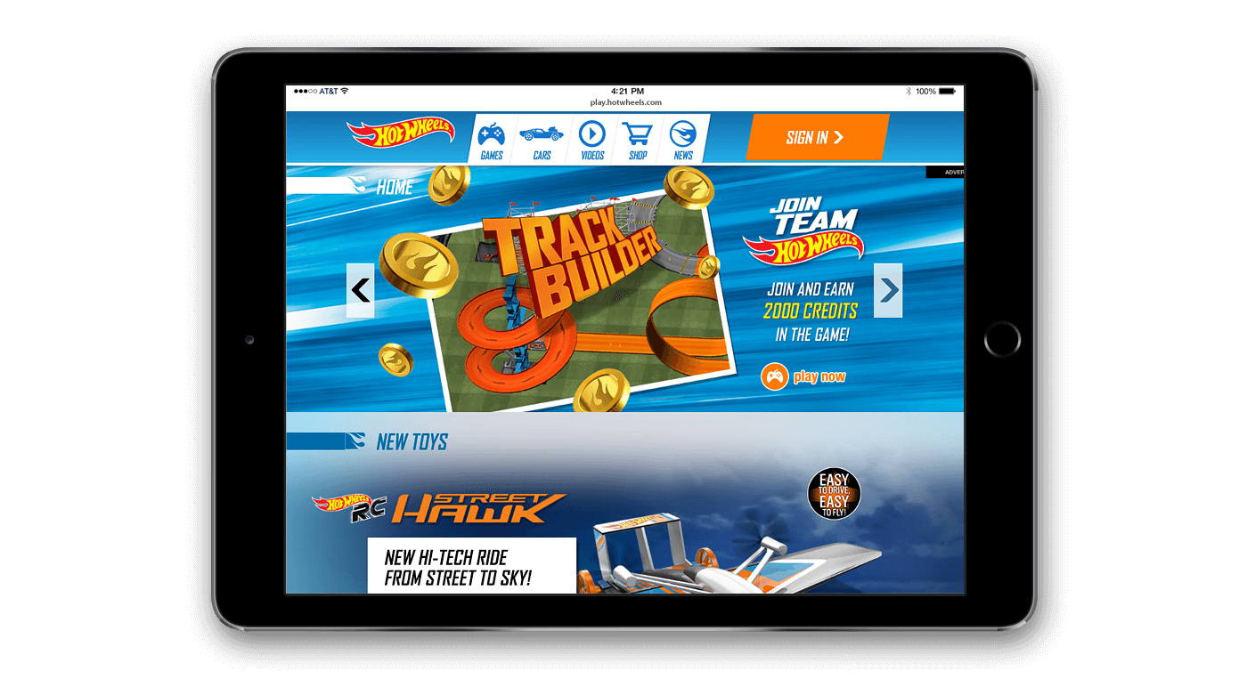
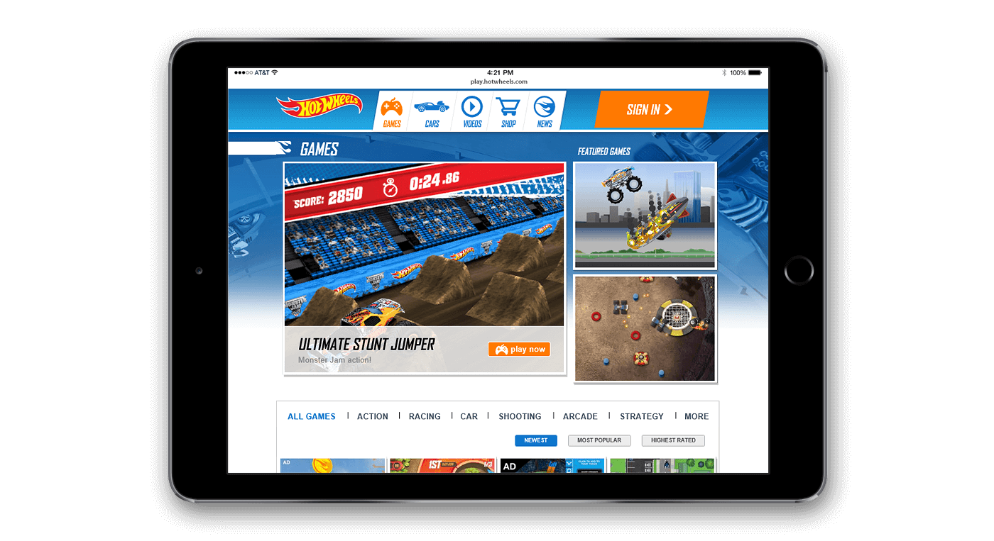
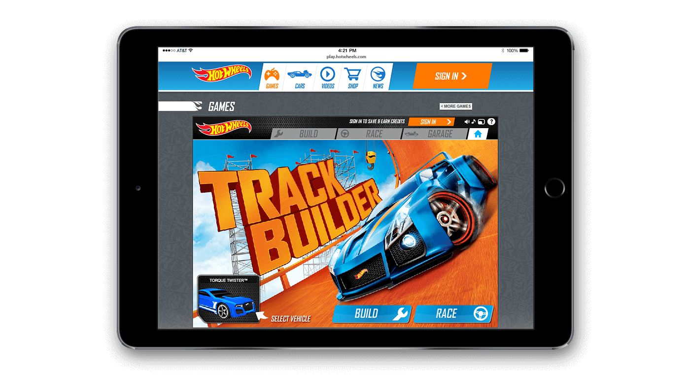
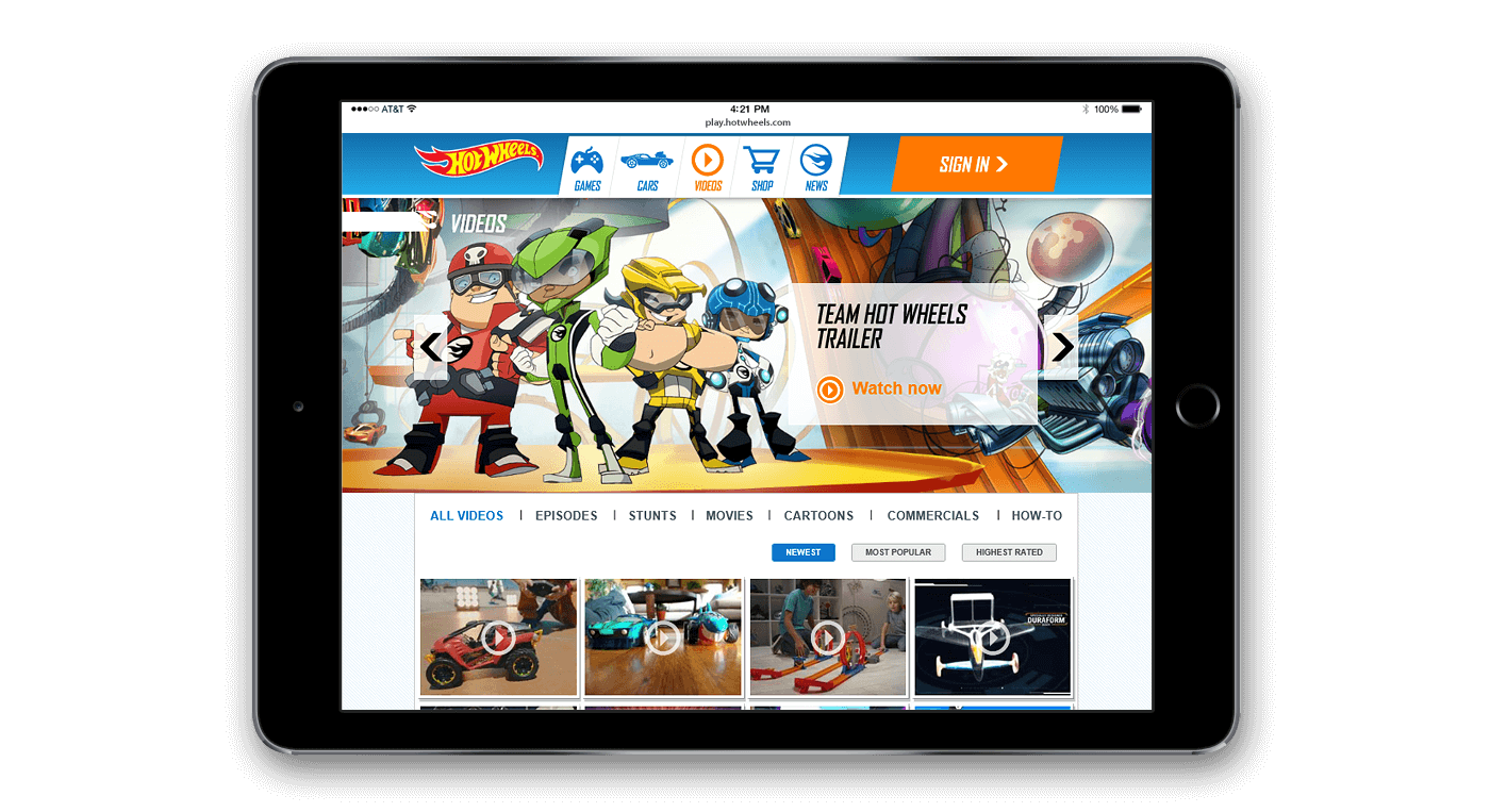
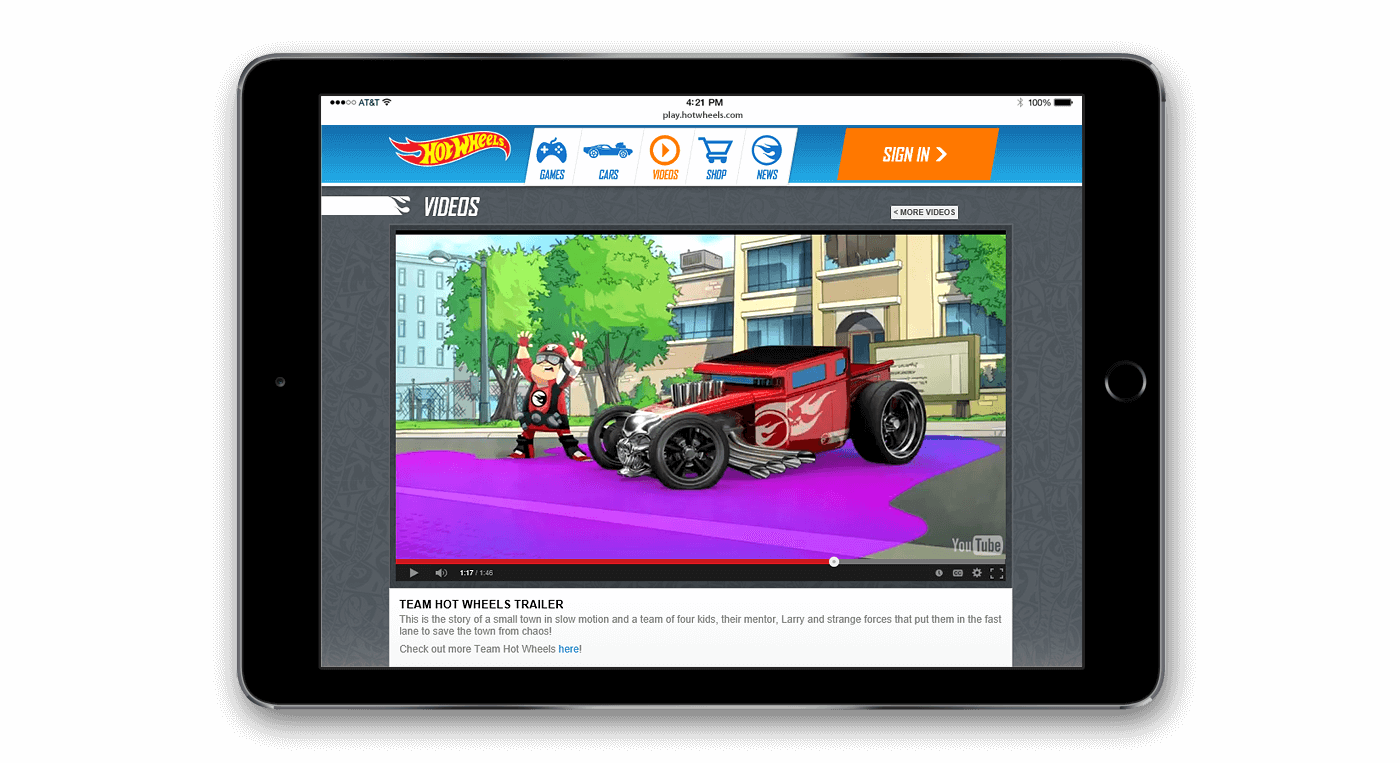
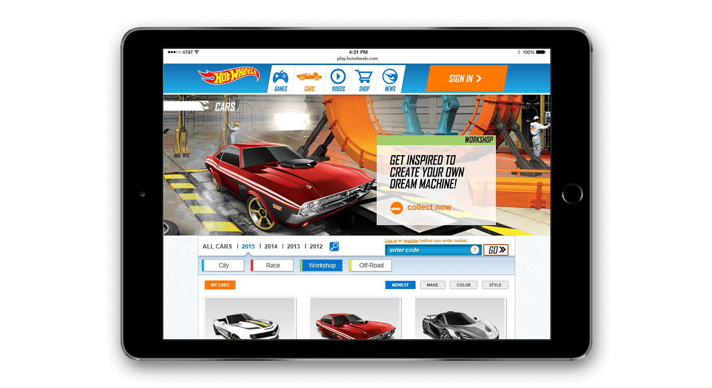
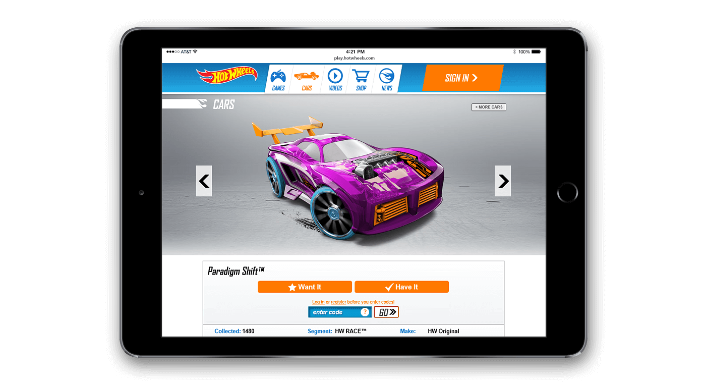
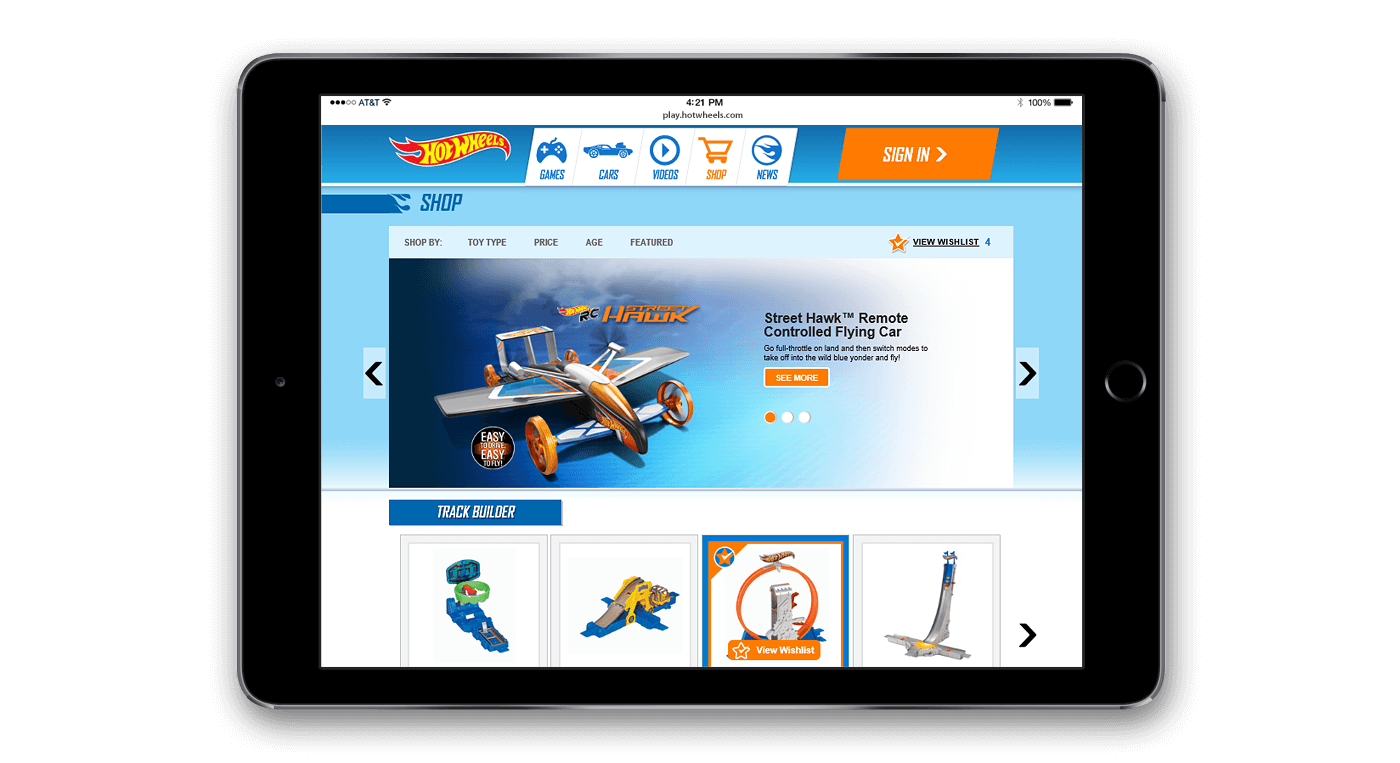
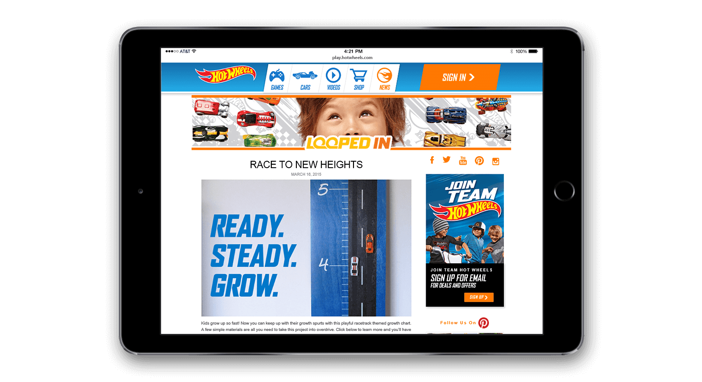
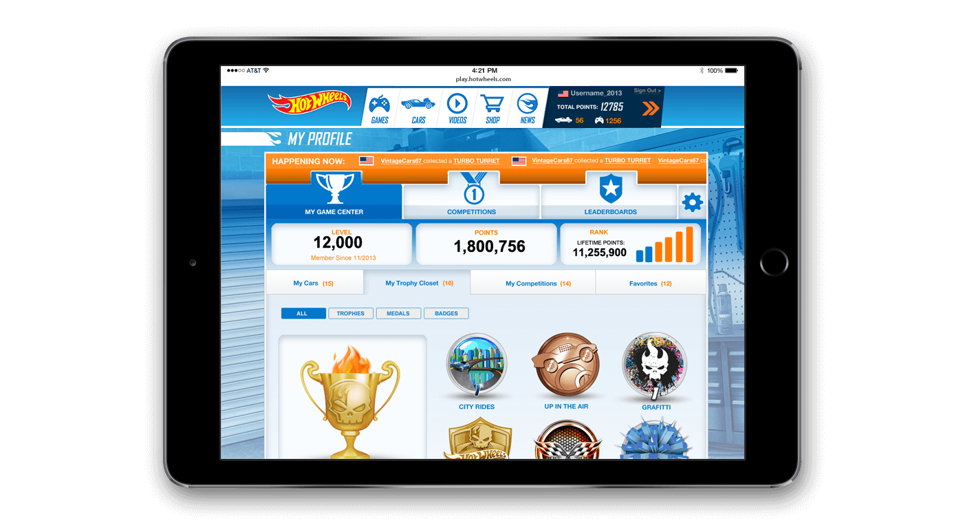
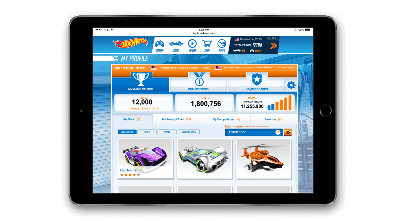
There were two goals for the Hot Wheels site redesign - update the look and feel, and create a single design solution that addressed promotional needs for markets around the globe. For look and feel we adapted and translated the latest branding standards to the digital space. To meet the global market needs we created a swappable module architecture that afforded great flexibility to customize according to needs. Our solution allowed local markets to stop creating one-off sites and benefit from a shared universal solution.
Modular Design
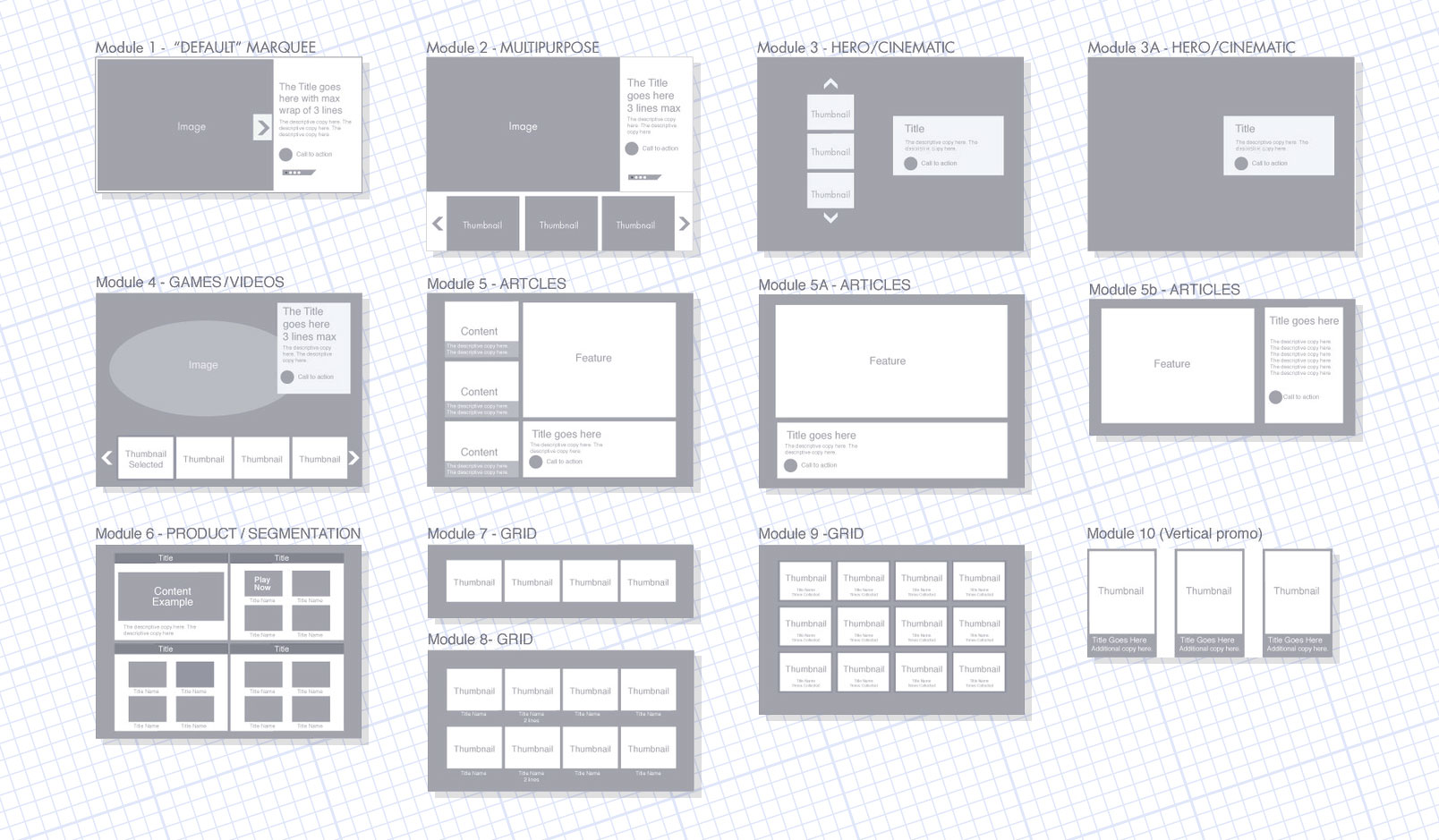
Our effort to design a customizable page layout system starting with a review of the promotional need of the Hot Wheels markets around the world. Many had created one-off sites. We were able to translate those needs into a collection of thirteen modules. Each swappable module was responsive and could be easily localized. Our site solution was so successful it was adapted for other Mattel brands. Thomas and Friends is an example.



GKGWebsite For Opening Of New Gym

Thomas & FriendsParent & Child Websites - Modular Approach

BarbieFull Digital Refresh

LuceworksShopping Hub For POD Business

Hot WheelsSite Redesign - Modular Approach
Shop & WishlistShopping Solution Across Mattel Brands
LADCP Story MapsVolume Production Tool & Method

CFRUWebsite For Prominent Urologist
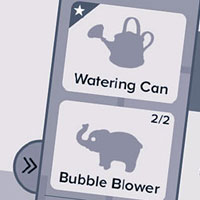
ABCmouseFeature Upgrades + Mobile Conversion

Max SteelFull Digital Refresh

Ever After HighFull Digital For New Toy Launch
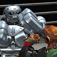
Real SteelProgressive-Release Boxing Game In Unity
Logo & BrandingVarious Projects - Logos, Guides, Branding
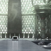
Wrigley's 5 GumGame For 'Stimulate Your Senses' Campaign
Arena ChallengeRobust Multiplayer Party Game

FCC-SoCalWeb Design, Email & CRM For Non-Profit
Disney ConnectionPremium Broadband Product For ISPs

Online GamesSingle & Micro-Multiplayer Games