MAX STEEL
Strategy | Art Direction | UX
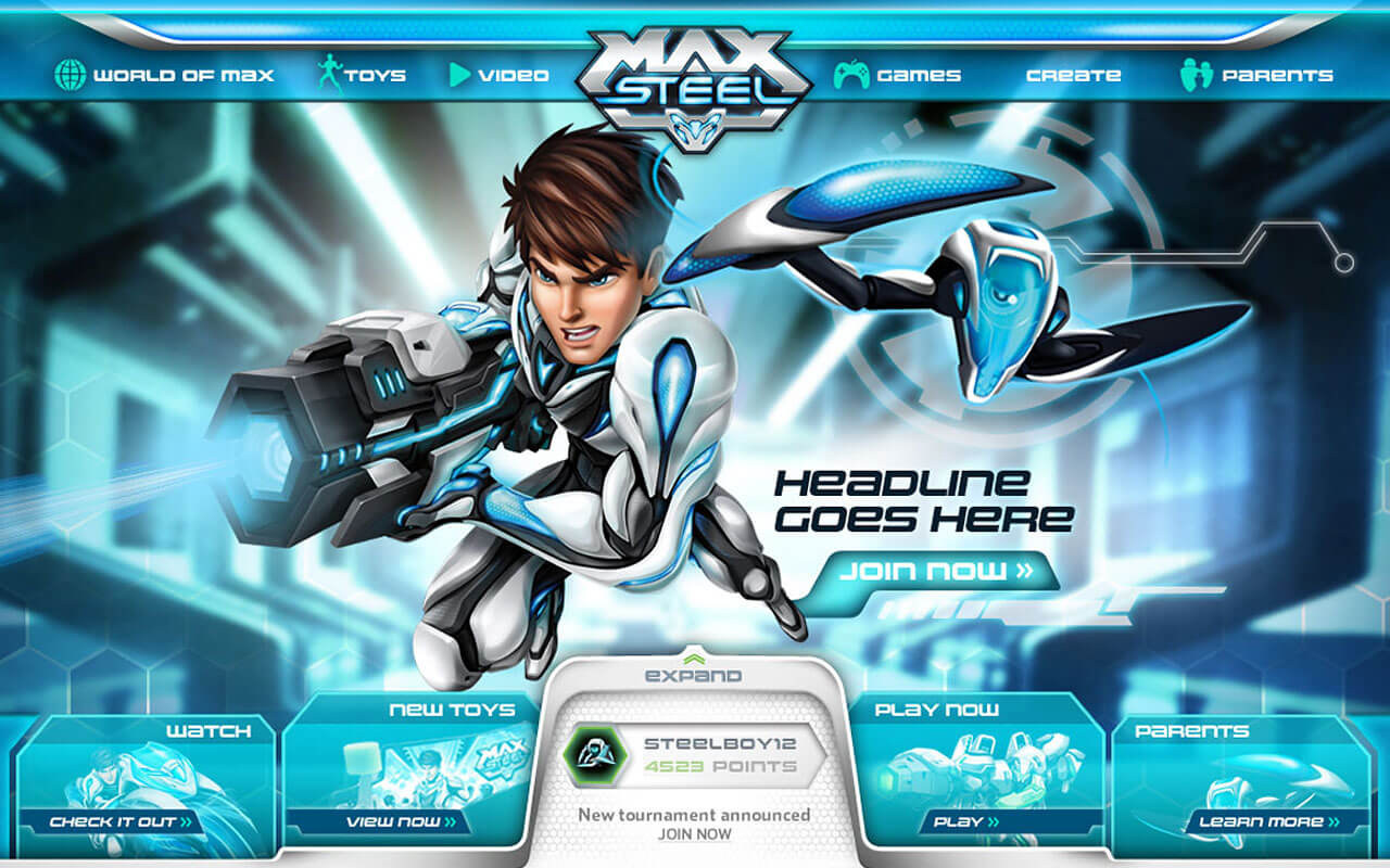
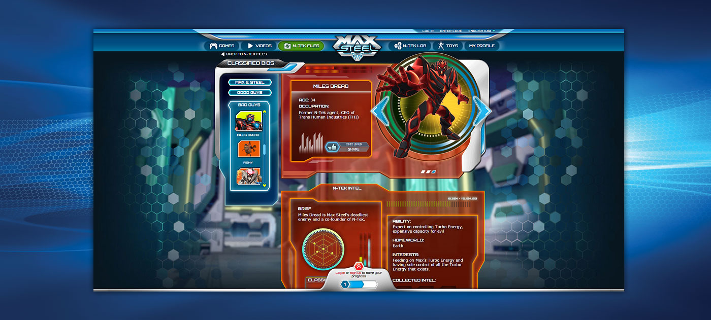
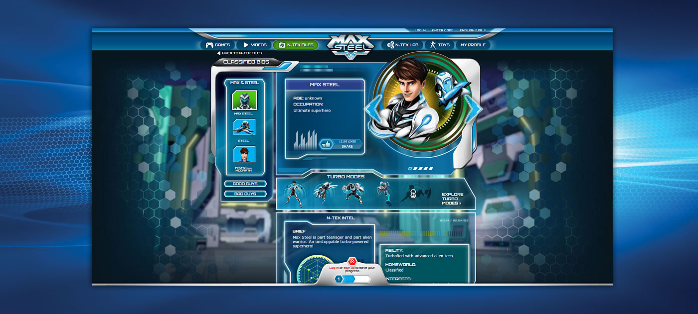
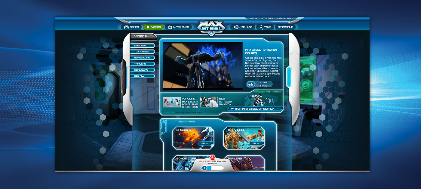
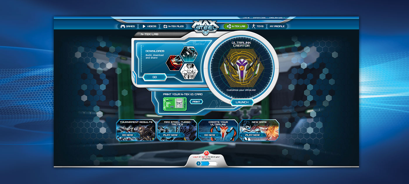
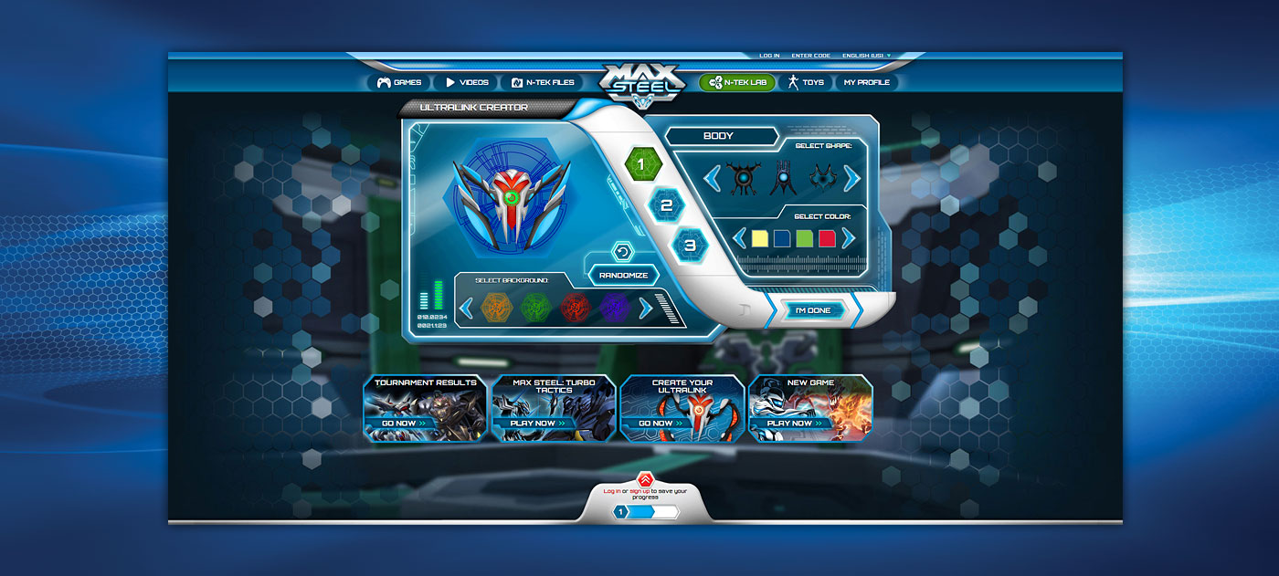
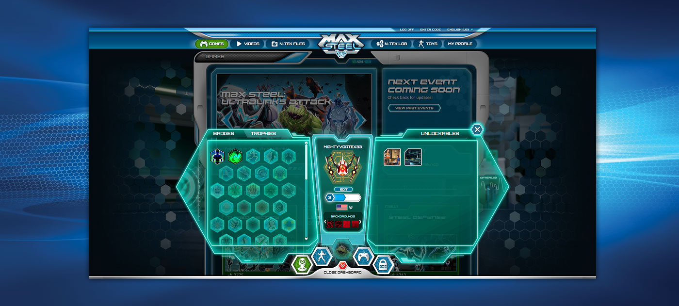
The Max Steel franchise underwent a comprehensive reboot in 2012. Mattel needed a new site to match the look, feel and spirit of the refresh. The old website, built in Flash, was full of animation, visual effects and interaction. The challenge was to dispense with Flash yet retain the appeal and dynamic quality that Flash provided and fans expected. We created a comprehensive digital style guide to keep agency and brand teams aligned.
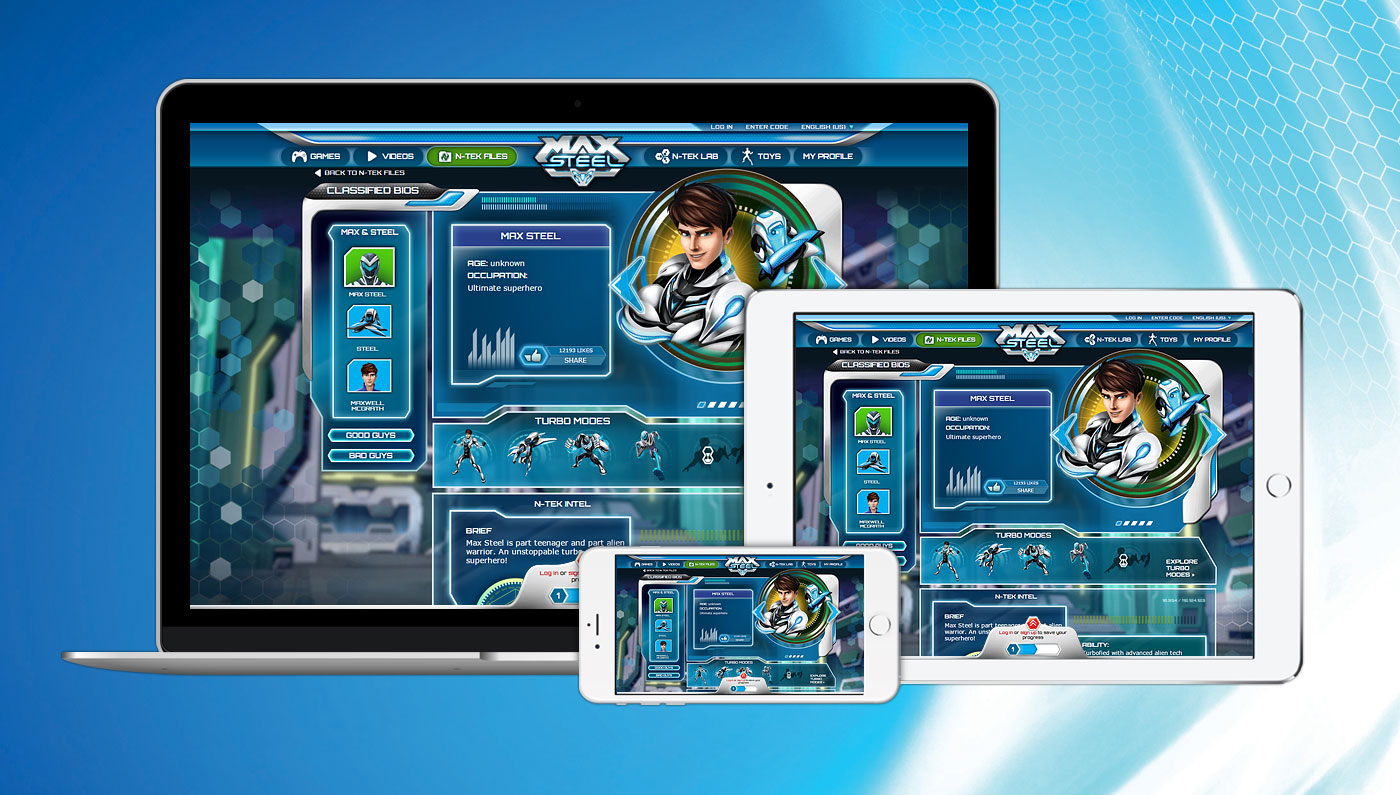
Responsive Design
All interfaces were designed to work in landscape mode across devices.
Digital Toolkit
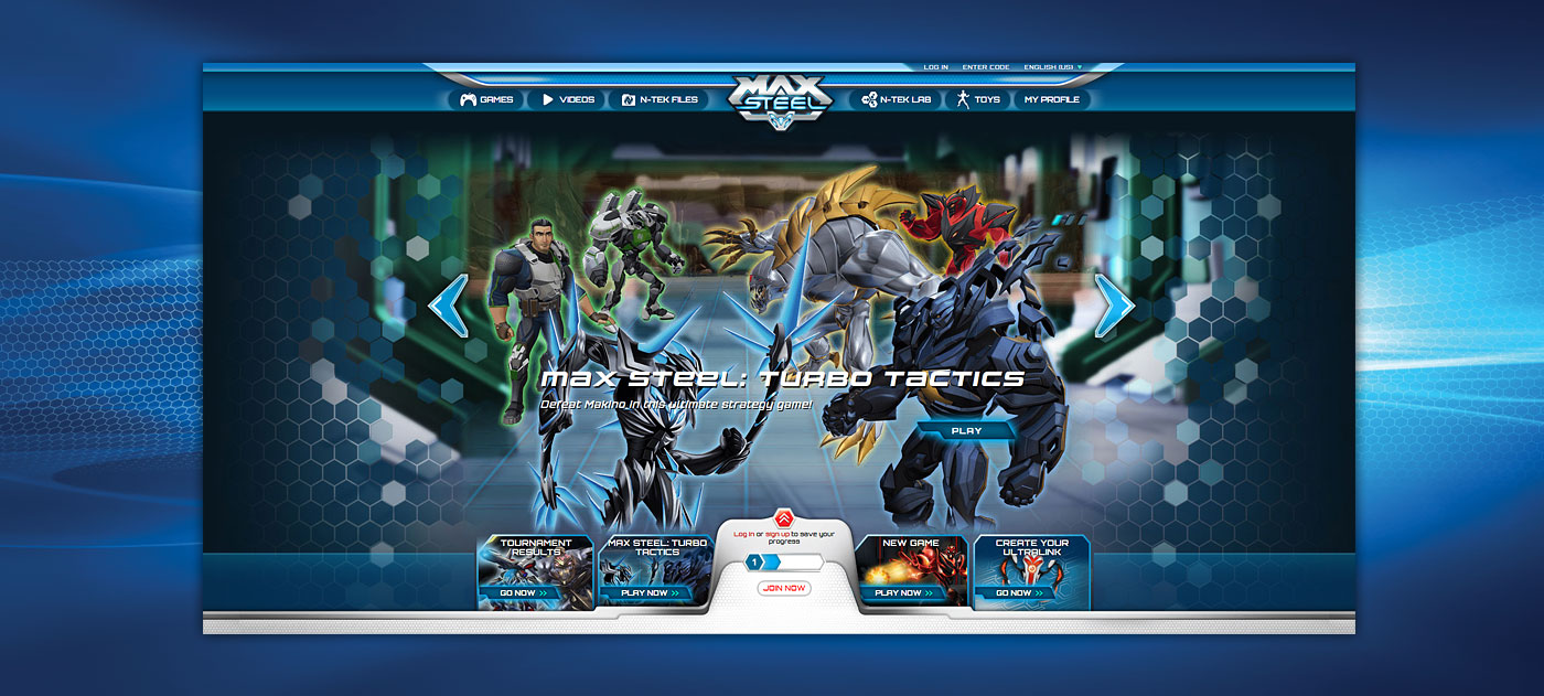
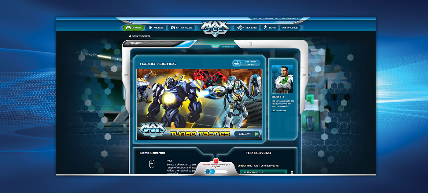
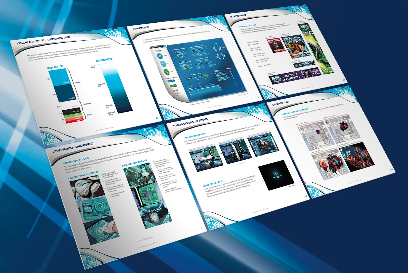
We developed a full style guide that interpreted the brand for the digital space and provided a complete toolkit of ready to use marketing elements and user interface components.


GKGWebsite For Opening Of New Gym

Thomas & FriendsParent & Child Websites - Modular Approach

BarbieFull Digital Refresh

LuceworksShopping Hub For POD Business

Hot WheelsSite Redesign - Modular Approach
Shop & WishlistShopping Solution Across Mattel Brands

LADCP Story MapsVolume Production Tool & Method

CFRUWebsite For Prominent Urologist

ABCmouseFeature Upgrades + Mobile Conversion

Max SteelFull Digital Refresh

Ever After HighFull Digital For New Toy Launch
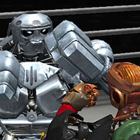
Real SteelProgressive-Release Boxing Game In Unity
Logo & BrandingVarious Projects - Logos, Guides, Branding
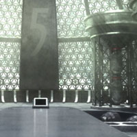
Wrigley's 5 GumGame For 'Stimulate Your Senses' Campaign
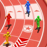
Arena ChallengeRobust Multiplayer Party Game

FCC-SoCalWeb Design, Email & CRM For Non-Profit
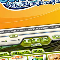
Disney ConnectionPremium Broadband Product For ISPs

Online GamesSingle & Micro-Multiplayer Games