THOMAS & FRIENDS
Strategy | Art Direction | UX
For the redesign of the Thomas & Friends website, our decision was to deliver separate experiences for the parent and child. Doing that opened the door on the parent's side for lifestyle photography, parallax scrolling and copy tailored to moms. On the kids side we focused on mobile first design appropriate for the preschool audience. The site is designed to be easily customized and deployed across international markets.
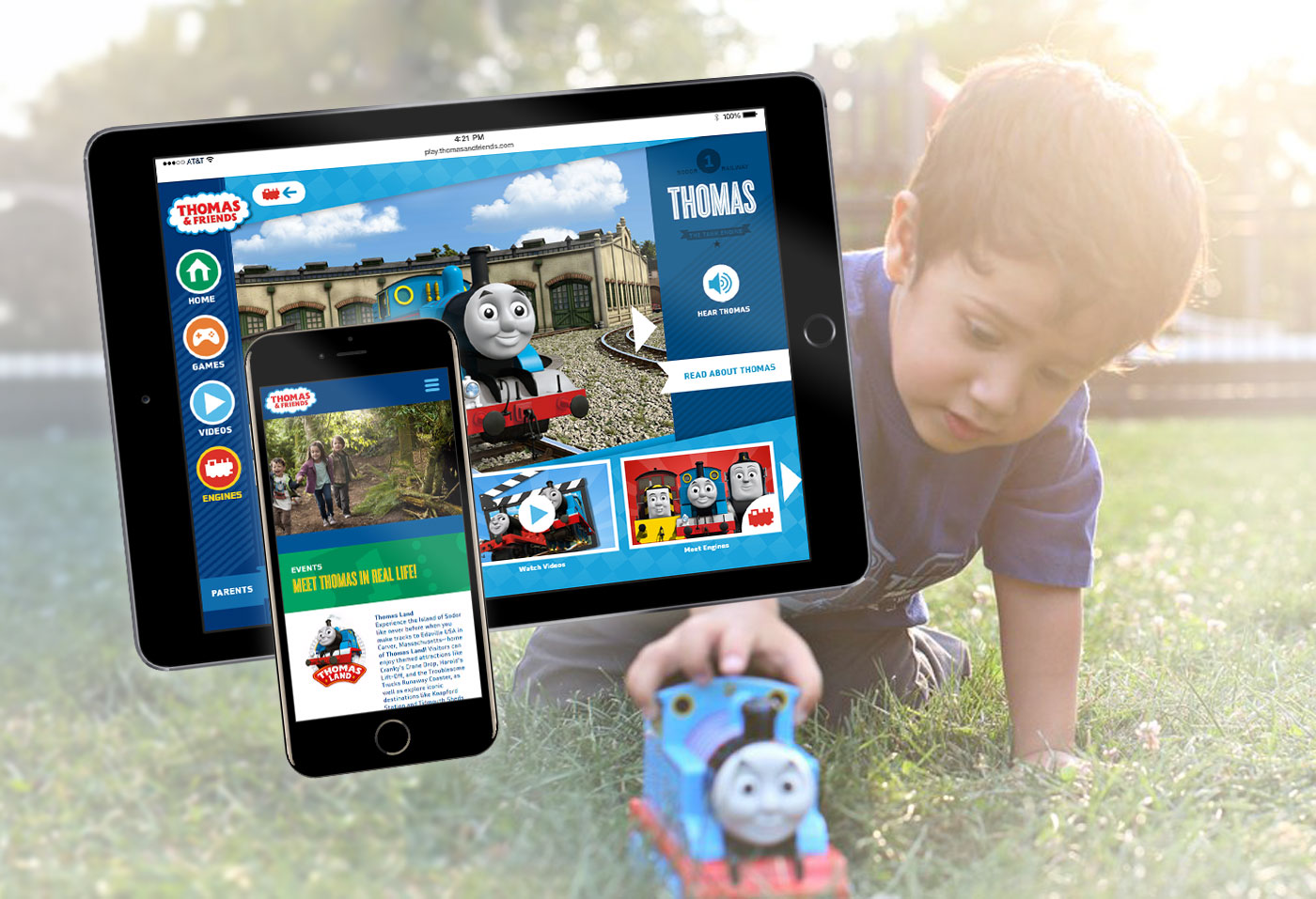
Kids
Goals included tablet-first design, simple navigation for pre-readers, an ad-free walled garden, and animation and clickable surprises throughout.
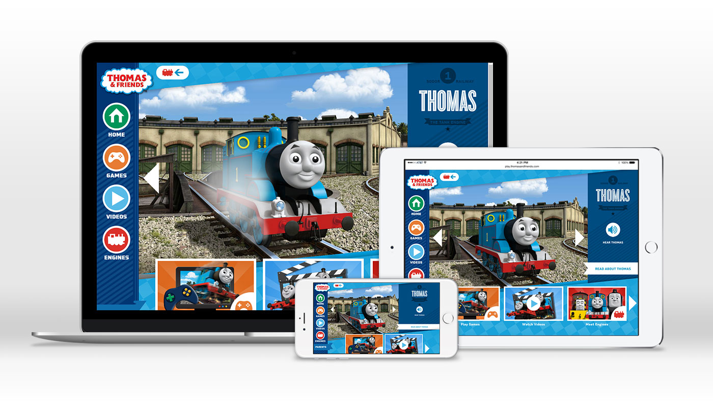



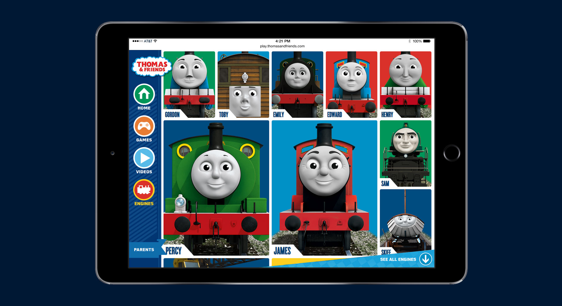

Parents
Goals included parallax text over images while scrolling, ample use of lifestyle photography, tailored messaging for moms, and an easily configured modular design to empower marketing teams across the global markets.


GKGWebsite For Opening Of New Gym

Thomas & FriendsParent & Child Websites - Modular Approach

BarbieFull Digital Refresh

LuceworksShopping Hub For POD Business

Hot WheelsSite Redesign - Modular Approach
Shop & WishlistShopping Solution Across Mattel Brands

LADCP Story MapsVolume Production Tool & Method

CFRUWebsite For Prominent Urologist

ABCmouseFeature Upgrades + Mobile Conversion

Max SteelFull Digital Refresh

Ever After HighFull Digital For New Toy Launch

Real SteelProgressive-Release Boxing Game In Unity

Logo & BrandingVarious Projects - Logos, Guides, Branding

Wrigley's 5 GumGame For 'Stimulate Your Senses' Campaign
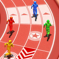
Arena ChallengeRobust Multiplayer Party Game

FCC-SoCalWeb Design, Email & CRM For Non-Profit
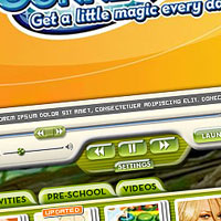
Disney ConnectionPremium Broadband Product For ISPs

Online GamesSingle & Micro-Multiplayer Games